Tabs
한 화면 내에서 콘텐츠를 탭 단위로 구분하여 전환할 수 있는 컴포넌트입니다.
Anatomy
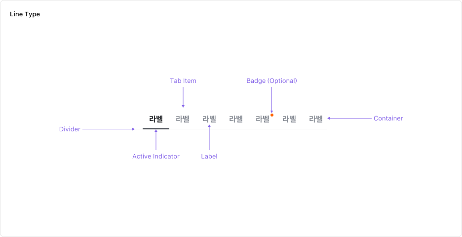
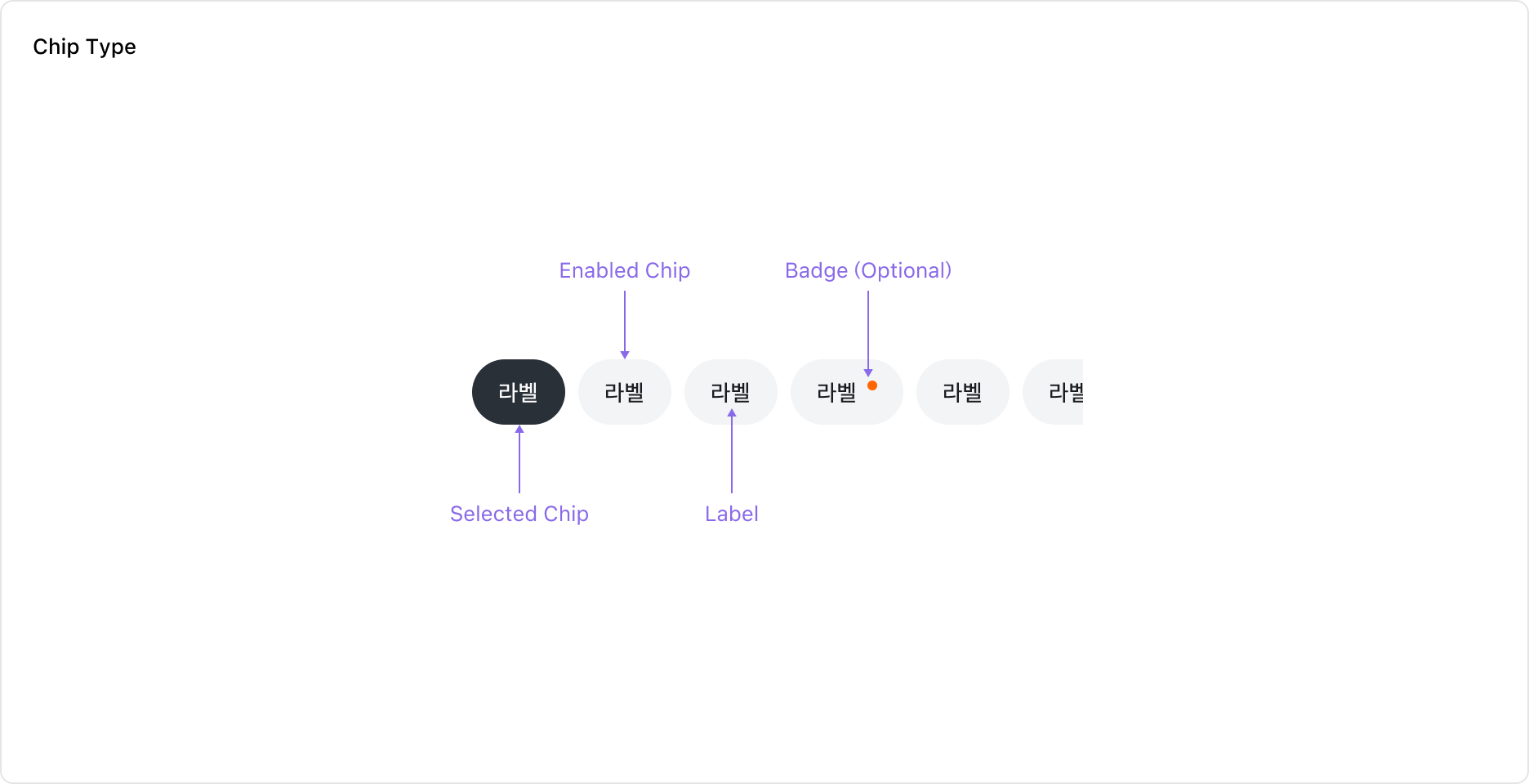
Tabs는 Label이 있는 Tab Item의 모음으로 구성되어 있습니다. Tab Item에는 필요에 따라 Notification Badge를 표시할 수 있습니다.
Properties
Variant
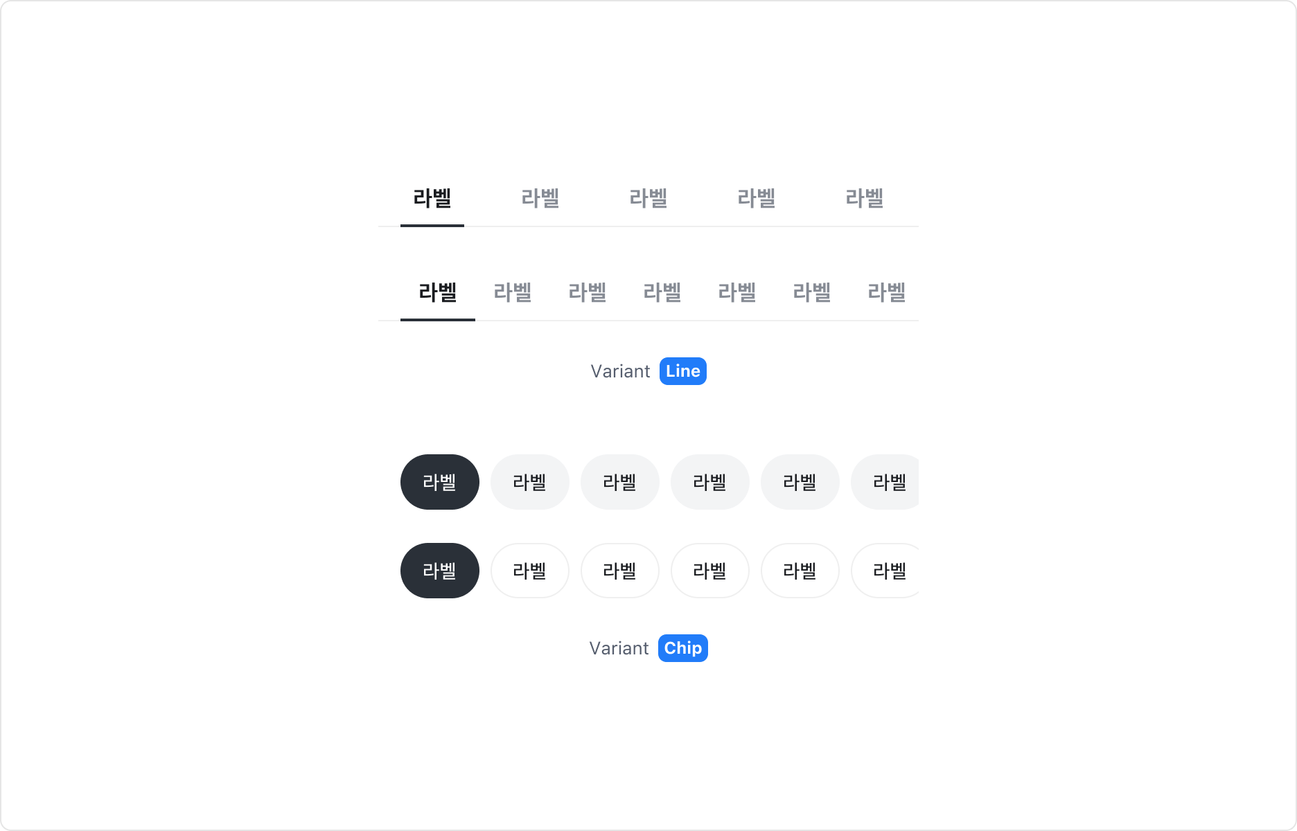
Tabs 컴포넌트는 두 가지 타입으로 구성되어 있습니다.
| Type | 스타일/레이아웃 |
|---|---|
| Line | Fill 레이아웃 (Tab Item을 꽉 차게 표시), Hug 레이아웃 (레이블 길이에 맞게 표시) |
| Chip | Solid 스타일, Outline 스타일 |
Size
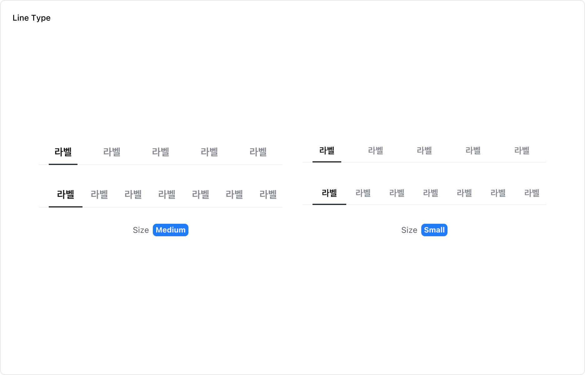

Line 타입은 Medium, Small 두 가지 Size를 가집니다. Chip 타입은 Large, Medium 두 가지 Size를 가집니다.
State
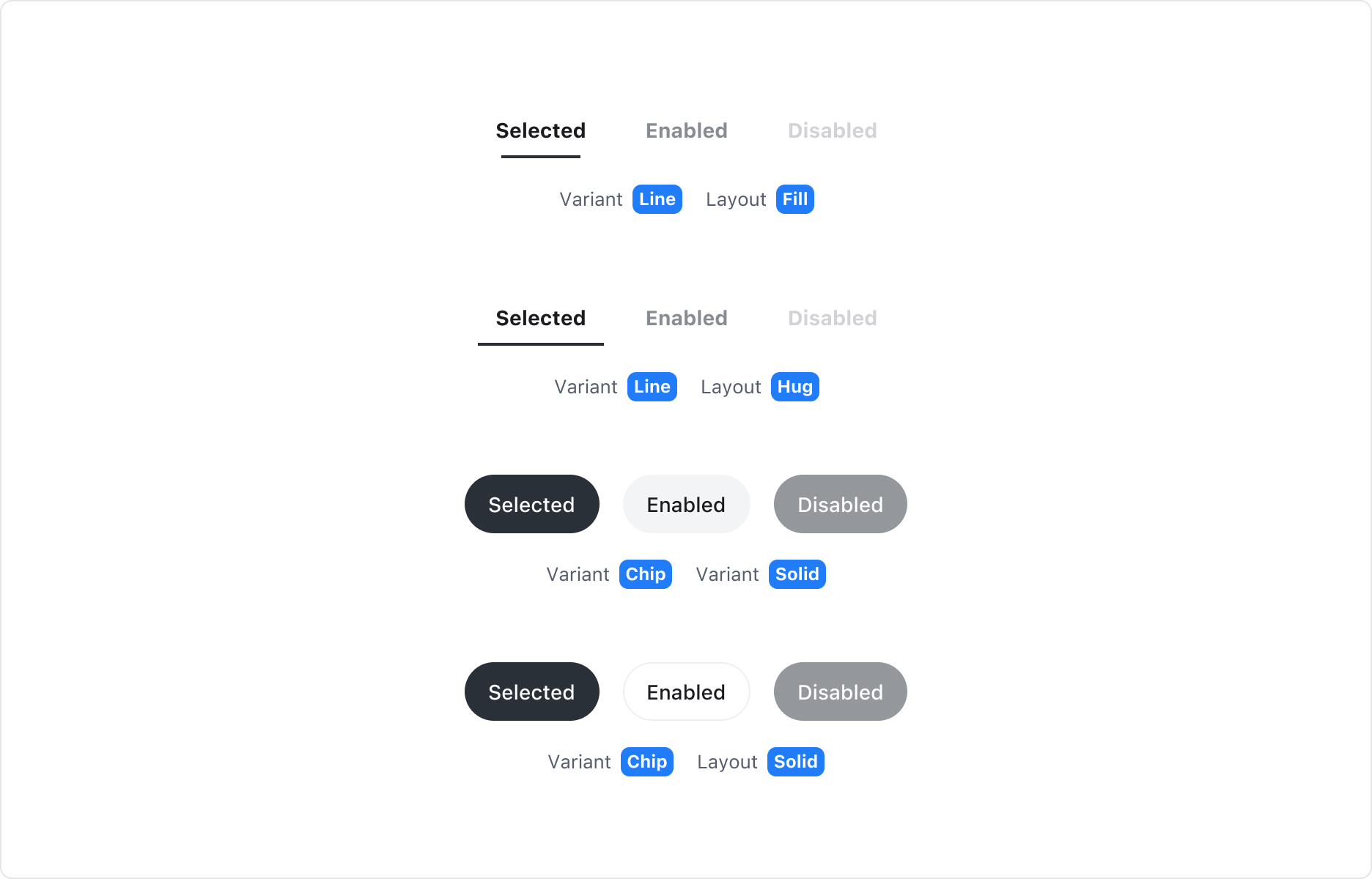
Tab Item은 Enabled, Selected, Disabled 상태를 가집니다.
Notification Property
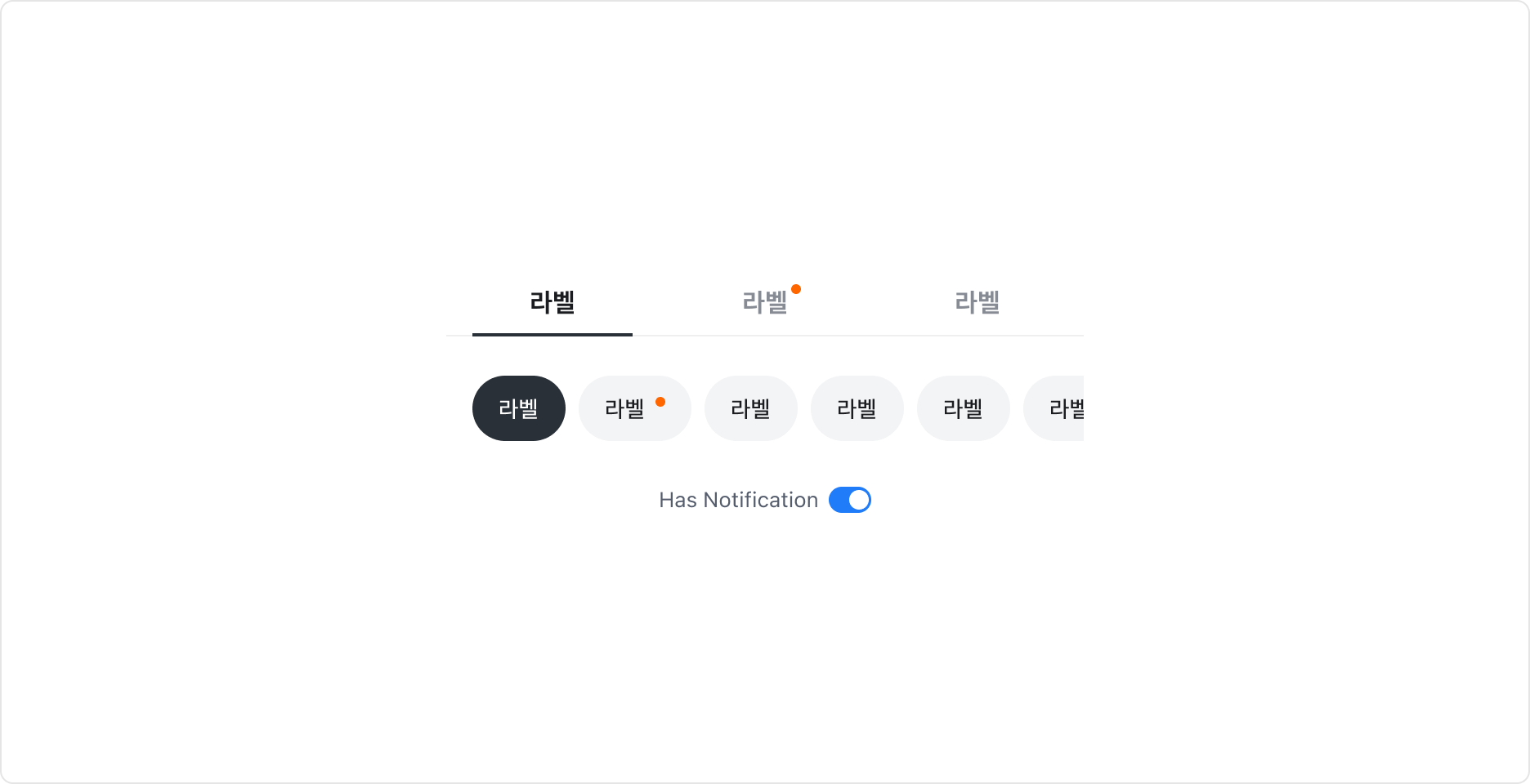
Tab Item에 탭에 새로운 콘텐츠가 있음을 알리는 Notification Badge를 표시할 수 있습니다.
Guidelines
Tabs 사이즈와 스타일 선택
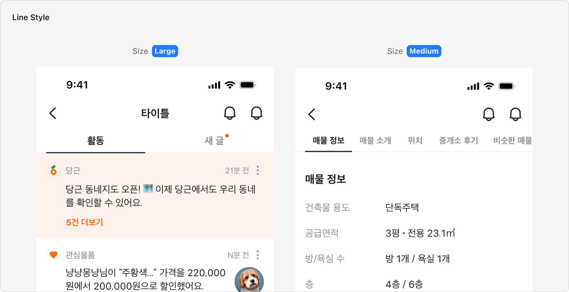

Tabs 컴포넌트는 Line과 Chip 두 가지 스타일로 구성되어 있습니다.
Line 타입은 Medium과 Small 두 가지 사이즈를 제공하며, Chip 타입은 Large와 Medium 두 가지 사이즈를 제공합니다. 화면 내 다른 요소와의 조합, 주목도에 따라 스타일과 사이즈를 선택하여 사용할 수 있습니다.
Large 사이즈는 화면 전체 콘텐츠를 전환하는 Navigation 역할에 적합하며, Medium 사이즈는 좁은 영역이나 스크롤 중간에서 서브 콘텐츠를 전환할 때 사용합니다.
Chip 타입을 사용하는 경우, 화면 전체의 콘텐츠를 전환하는 경우에 Solid 스타일을, 일부 콘텐츠를 전환하는 경우에는 Outline 타입을 사용하길 권장합니다.
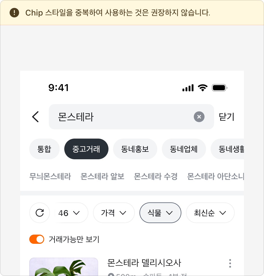
또한 화면 내 다른 Chip 요소와 조합하여 사용하는 경우 동작에 혼란이 없도록 서로 다른 스타일을 적용해야 합니다.
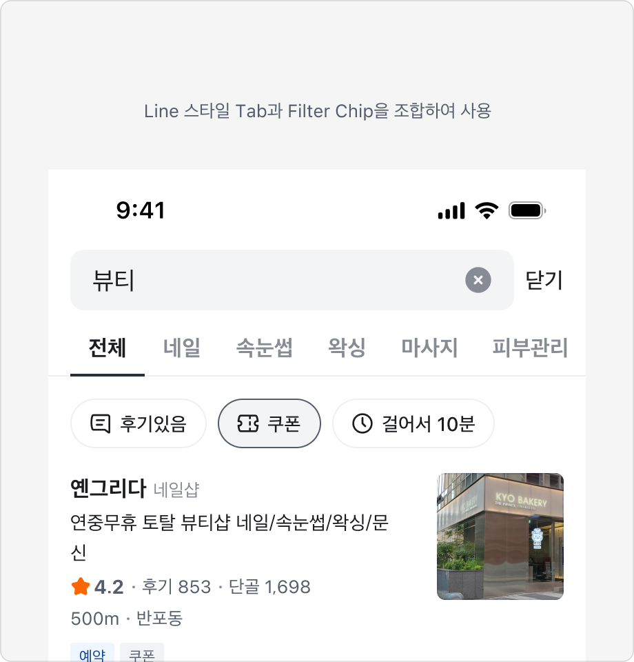
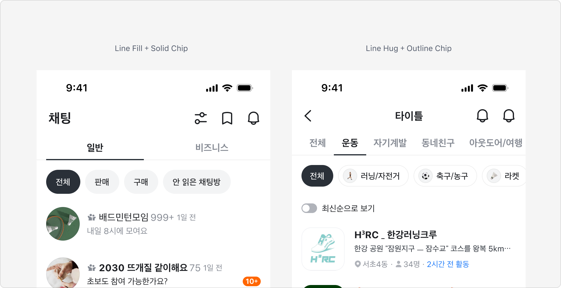
Line 스타일에서 Fill과 Hug 레이아웃 사용하기
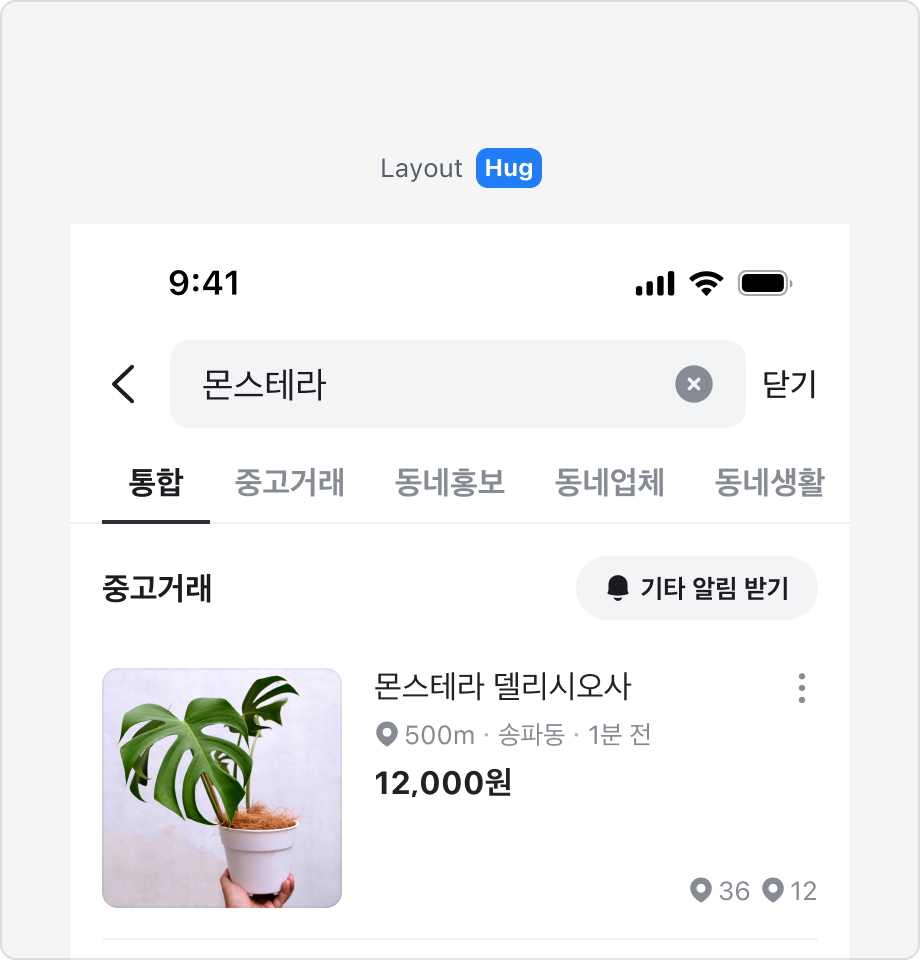
Line 타입에서는 Tab Item을 꽉 차게 표시하는 Fill 레이아웃과 Tab Item을 레이블 길이에 맞게 표시하는 Hug 레이아웃을 사용할 수 있습니다.
Fill 레이아웃은 Tab Item이 많지 않을 경우에 적합하며, 최대 5개의 탭을 표시할 수 있습니다.
Tab Item이 6개 이상이거나 레이블이 길어지는 경우에는 Hug 레이아웃 사용을 권장합니다.
탭에 새로운 콘텐츠가 있음을 알리기
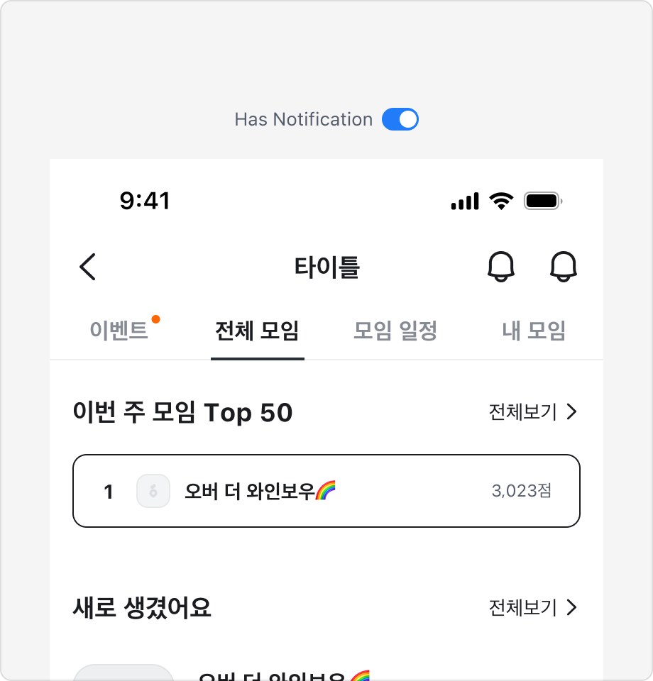
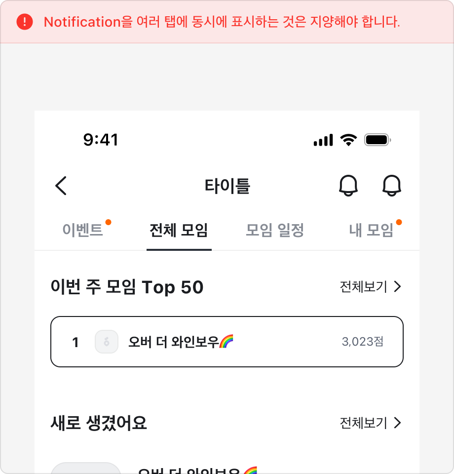
Tab Item에는 새로운 콘텐츠가 있음을 알리는 Notification Badge를 표시할 수 있습니다.
Notification Badge는 콘텐츠를 확인하면 사라지는 동작을 하며, 여러 탭에 동시에 표시하는 것은 지양해야 합니다.
2 Depth로 Tabs 구조 사용하기
2차 카테고리와 같이 Tab의 구조를 이중으로 표시하는 경우 서로 다른 탭의 스타일을 조합하여 사용합니다.
1차 분류에는 Line 타입, 2차 분류에는 Chip 타입의 Tabs를 조합하여 사용하는 것을 권장합니다.
Tabs V3 변경점
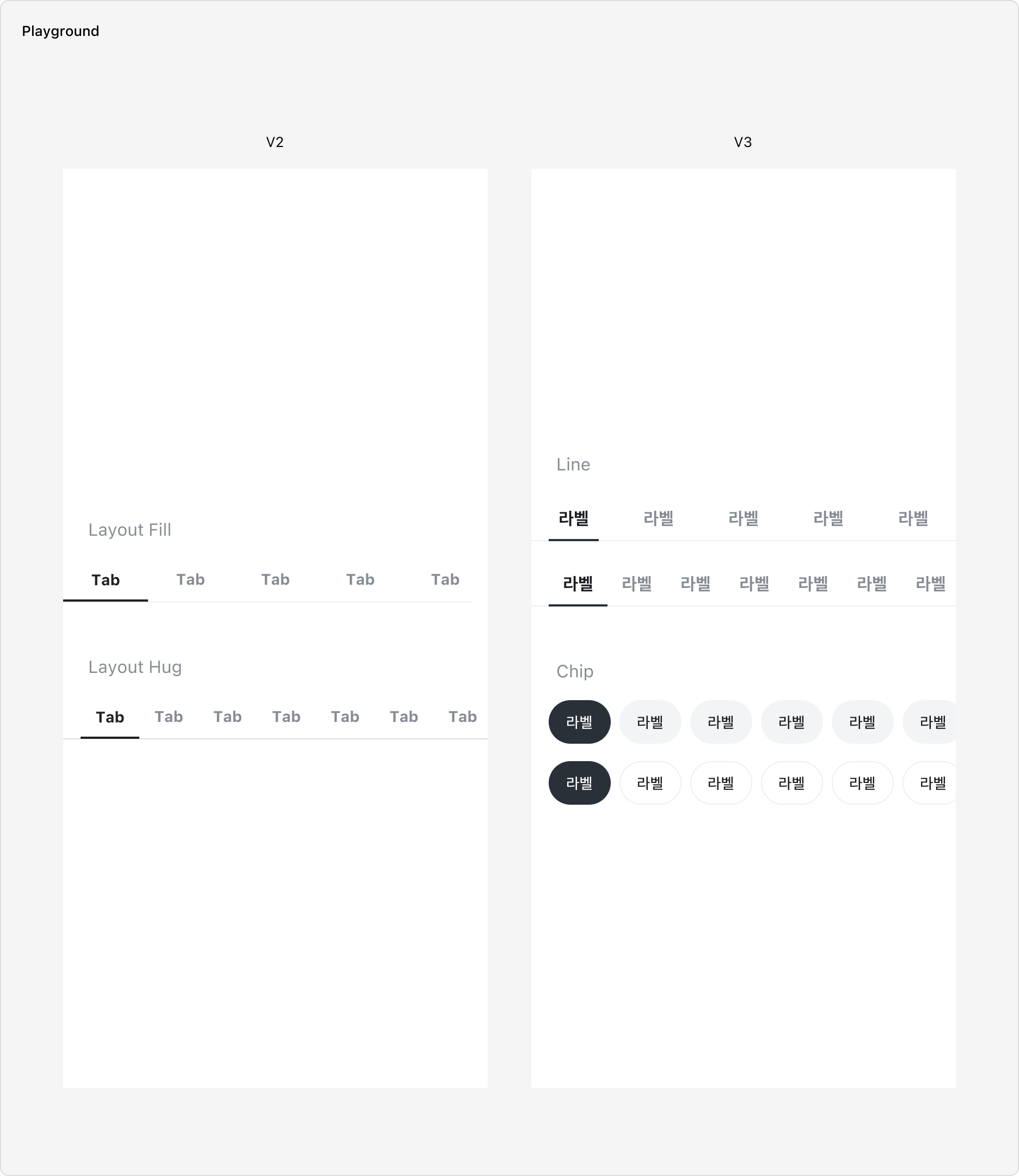
- Chip 스타일의 Variant를 추가했습니다.
- 기존 사이즈를 Medium으로 하며, 새롭게 Large 사이즈를 추가했습니다.
- Line Fill 레이아웃에서 Active Indicator의 좌우 여백이 추가되었습니다.
Specification
Tablist
base
| 상태 | 슬롯 | 속성 | 값 |
|---|---|---|---|
| enabled | root | color | |
| strokeBottomWidth | 1px | ||
| strokeColor | |||
| indicator | height | 2px | |
| color | |||
| transformDuration | |||
| transformTimingFunction |
layout=hug
| 상태 | 슬롯 | 속성 | 값 |
|---|---|---|---|
| enabled | root | paddingX | |
| indicator | insetX | 0px |
layout=fill
| 상태 | 슬롯 | 속성 | 값 |
|---|---|---|---|
| enabled | root | paddingX | 0px |
| indicator | insetX |
size=small
| 상태 | 슬롯 | 속성 | 값 |
|---|---|---|---|
| enabled | root | height | 40px |
size=medium
| 상태 | 슬롯 | 속성 | 값 |
|---|---|---|---|
| enabled | root | height | 44px |
Tab
base
| 상태 | 슬롯 | 속성 | 값 |
|---|---|---|---|
| enabled | label | color | |
| selected | label | color | |
| disabled | label | color |
size=medium
| 상태 | 슬롯 | 속성 | 값 |
|---|---|---|---|
| enabled | root | minHeight | 44px |
| paddingX | |||
| paddingY | |||
| label | fontSize | ||
| lineHeight | |||
| fontWeight |
size=small
| 상태 | 슬롯 | 속성 | 값 |
|---|---|---|---|
| enabled | root | minHeight | 40px |
| paddingX | |||
| paddingY | |||
| label | fontSize | ||
| lineHeight | |||
| fontWeight |
Chip Tablist
base
| 상태 | 슬롯 | 속성 | 값 |
|---|---|---|---|
| enabled | root | paddingX | |
| gap | 8px |
variant=neutralSolid
| 상태 | 슬롯 | 속성 | 값 |
|---|---|---|---|
| enabled | root | gap | 8px |
variant=neutralOutline
| 상태 | 슬롯 | 속성 | 값 |
|---|---|---|---|
| enabled | root | gap | 8px |
variant=brandSolid
| 상태 | 슬롯 | 속성 | 값 |
|---|---|---|---|
| enabled | root | gap | 8px |
Chip Tab
base
| 상태 | 슬롯 | 속성 | 값 |
|---|---|---|---|
| enabled | root | colorDuration | |
| colorTimingFunction | |||
| paddingY | |||
| cornerRadius | |||
| label | fontWeight |
size=medium
| 상태 | 슬롯 | 속성 | 값 |
|---|---|---|---|
| enabled | root | paddingX | |
| minHeight | 36px | ||
| label | fontSize |
size=large
| 상태 | 슬롯 | 속성 | 값 |
|---|---|---|---|
| enabled | root | paddingX | |
| minHeight | 40px | ||
| label | fontSize |
variant=neutralSolid
| 상태 | 슬롯 | 속성 | 값 |
|---|---|---|---|
| enabled | root | color | |
| label | color | ||
| enabled, pressed | root | color | |
| selected | root | color | |
| label | color | ||
| selected, pressed | root | color | |
| disabled | label | color | |
| selected, disabled | root | color | |
| label | color |
variant=neutralOutline
| 상태 | 슬롯 | 속성 | 값 |
|---|---|---|---|
| enabled | root | color | |
| stroke | |||
| label | color | ||
| enabled, pressed | root | color | |
| selected | root | color | |
| label | color | ||
| selected, pressed | root | color | |
| disabled | label | color | |
| selected, disabled | root | color | |
| label | color |
variant=brandSolid
| 상태 | 슬롯 | 속성 | 값 |
|---|---|---|---|
| enabled | root | color | |
| label | color | ||
| enabled, pressed | root | color | |
| selected | root | color | |
| label | color | ||
| selected, pressed | root | color | |
| disabled | root | color | |
| label | color | ||
| selected, disabled | root | color |
Last updated on